MaRS
Brand Refresh
2018
Brand Refresh
2018
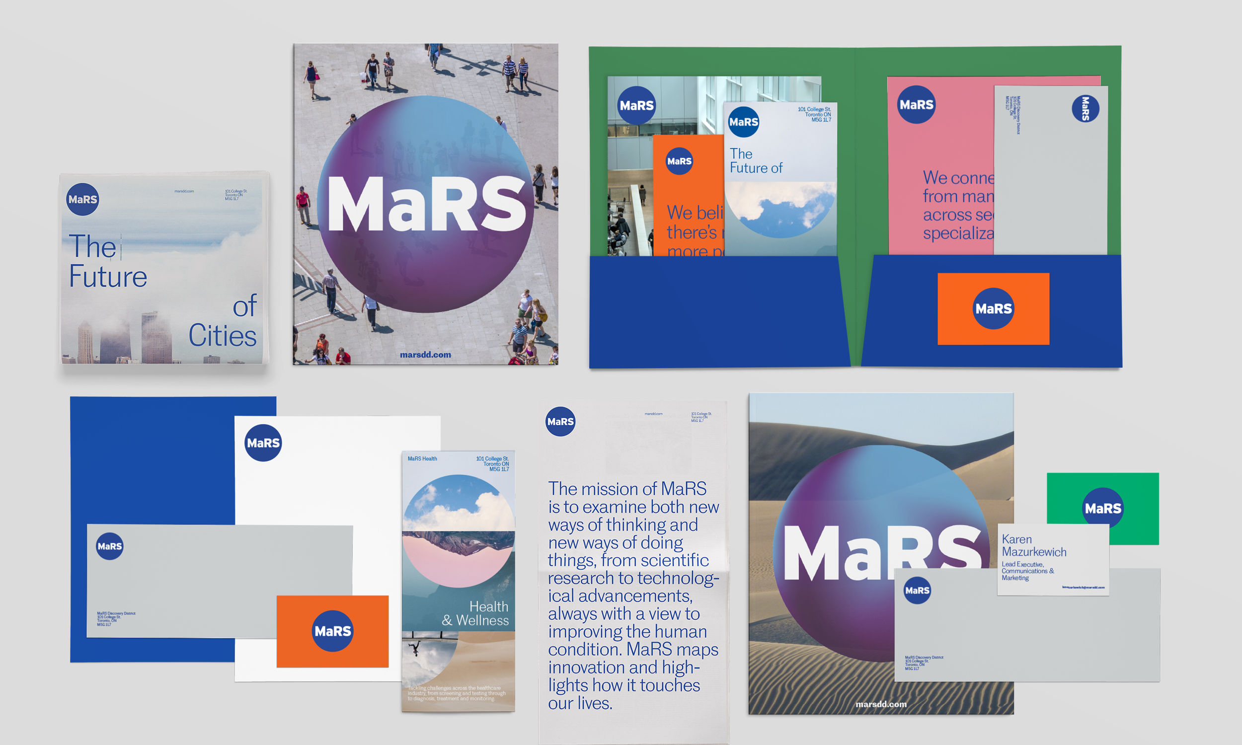
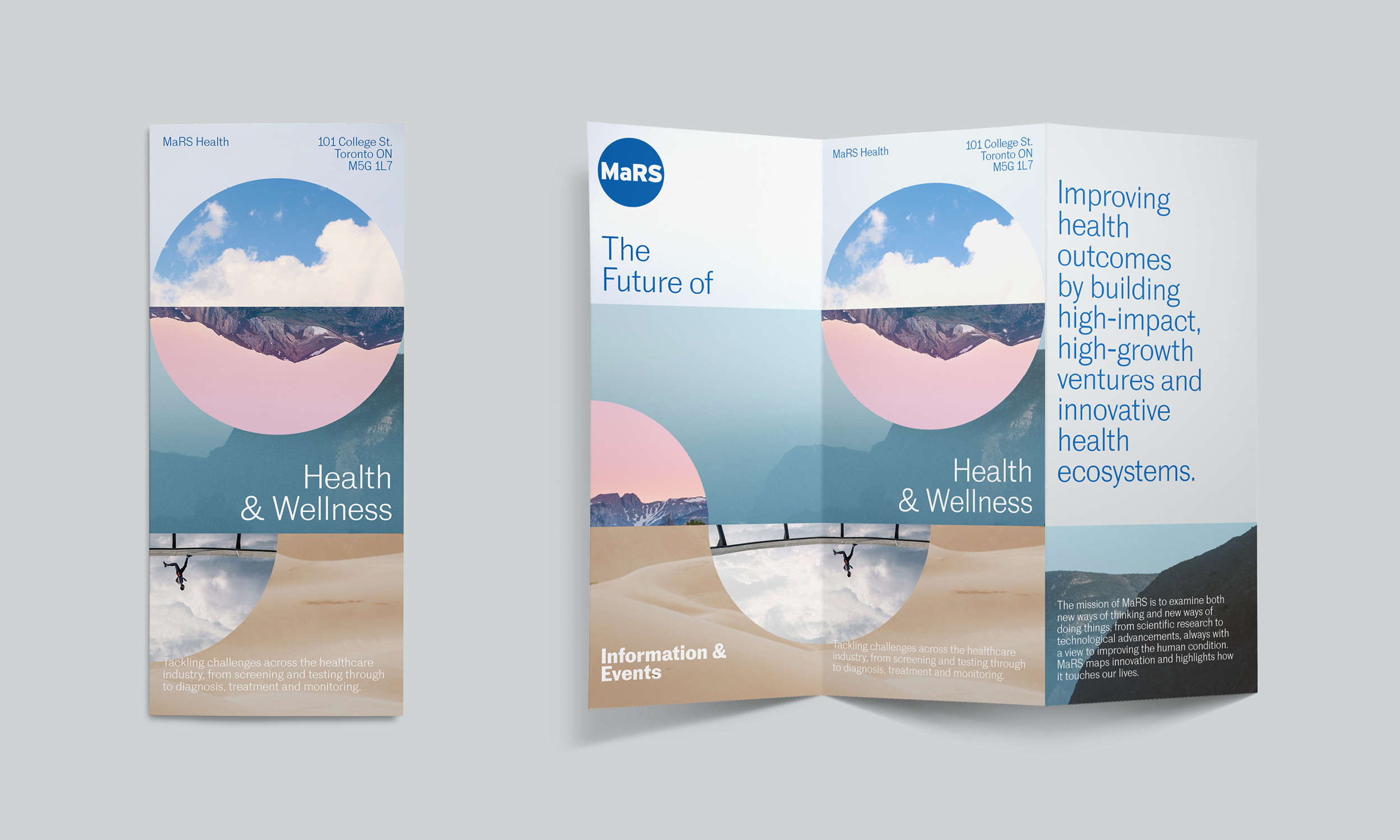
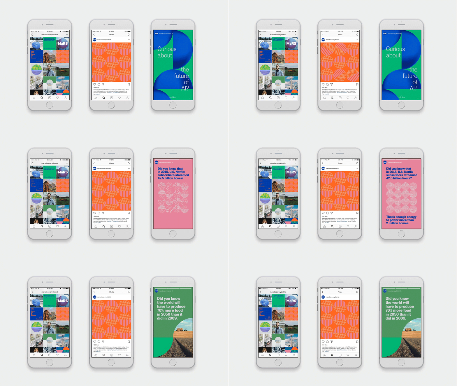
MaRS is one of the largest innovation hubs in the world but its identify felt cold and institutional as it moved into the future. A rebrand was needed to better reflect the big things going on inside.
Completed at Sid Lee.
Executive Creative Director:
Tom Koukodimos
Creative Director:
Laura Stein
Design:
Ariane Leblanc, Dominic Liu, Josephine Guan
Writing:
Zach Radford
Executive Creative Director:
Tom Koukodimos
Creative Director:
Laura Stein
Design:
Ariane Leblanc, Dominic Liu, Josephine Guan
Writing:
Zach Radford
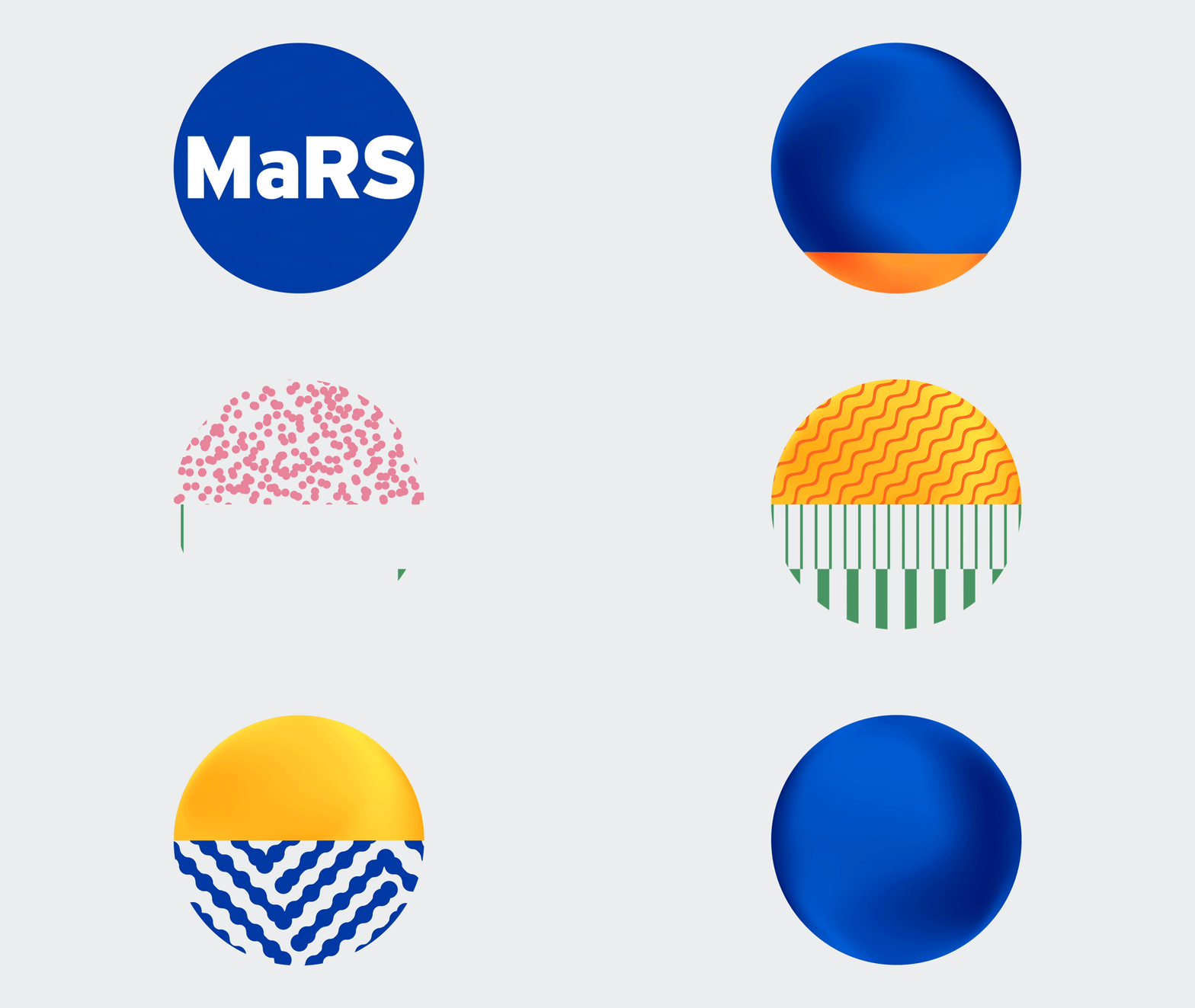
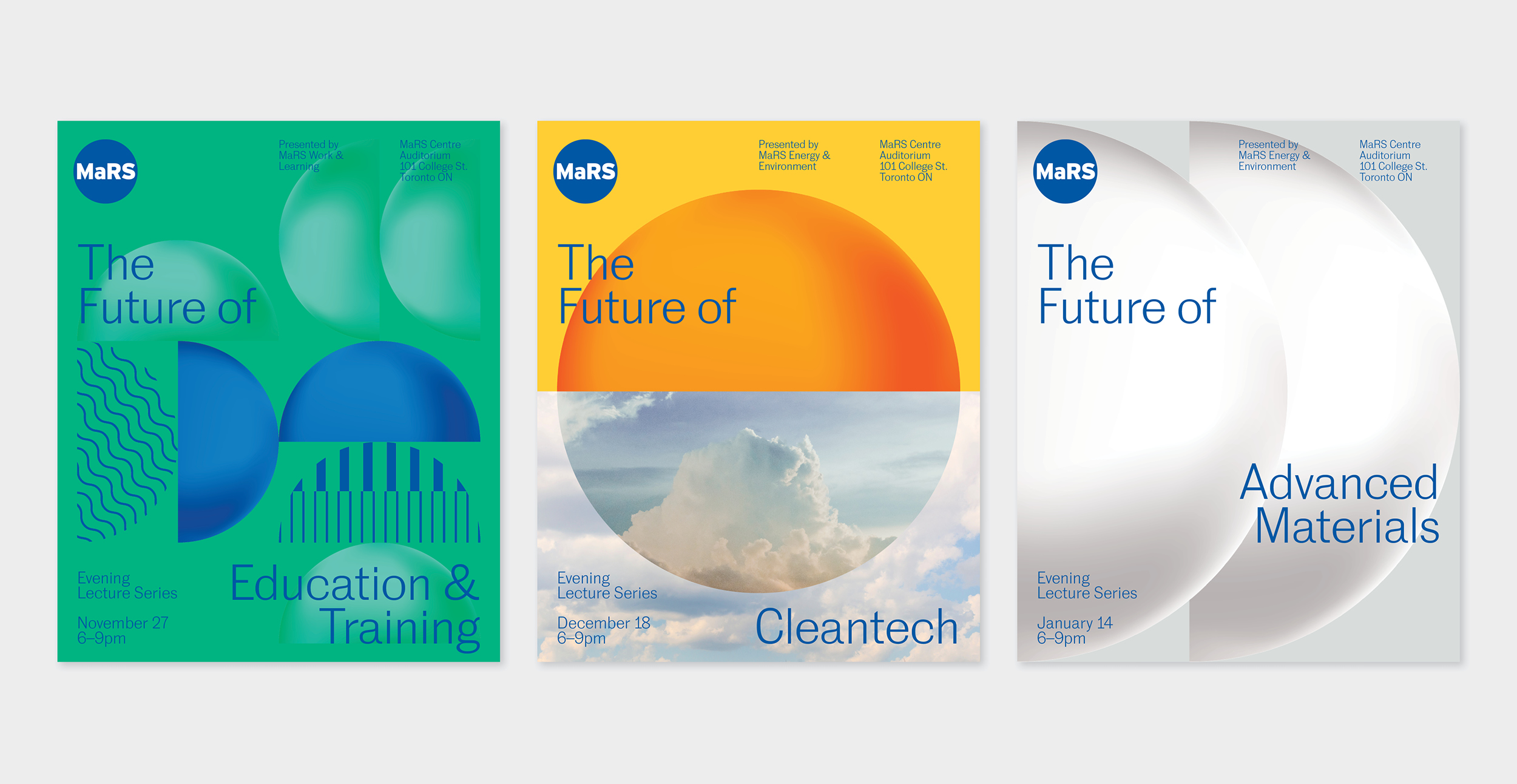
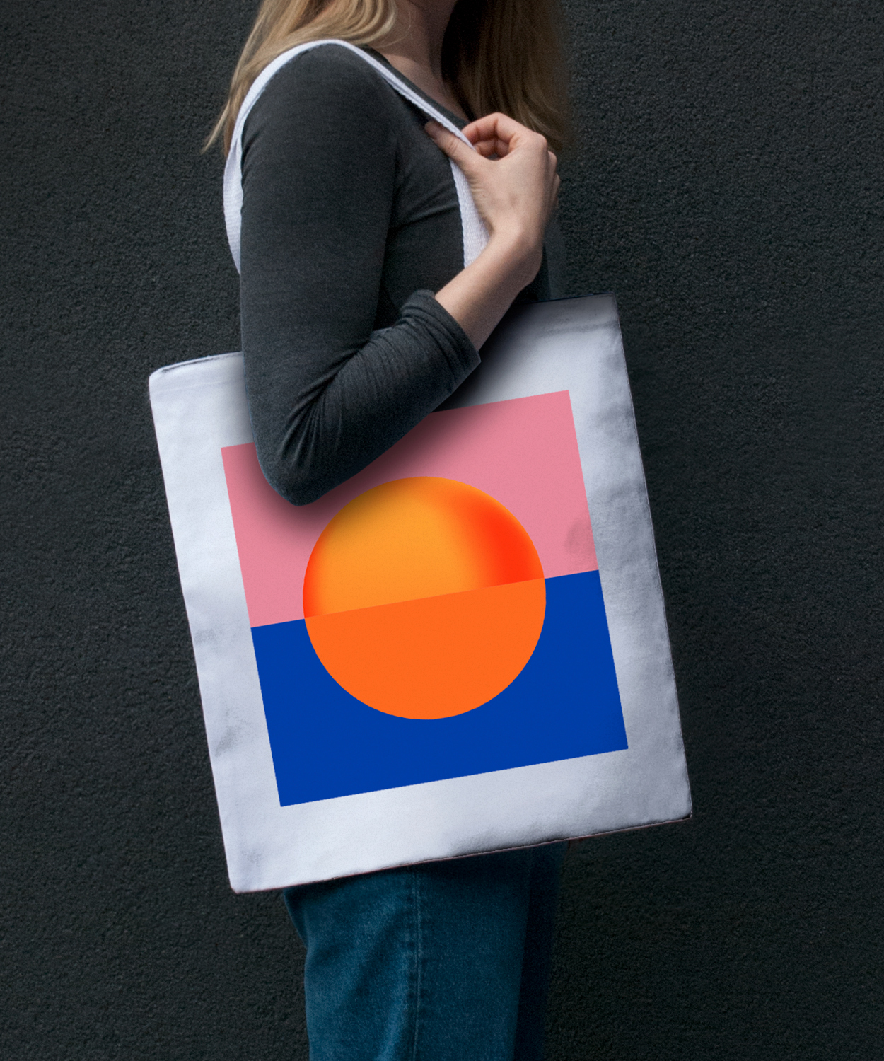
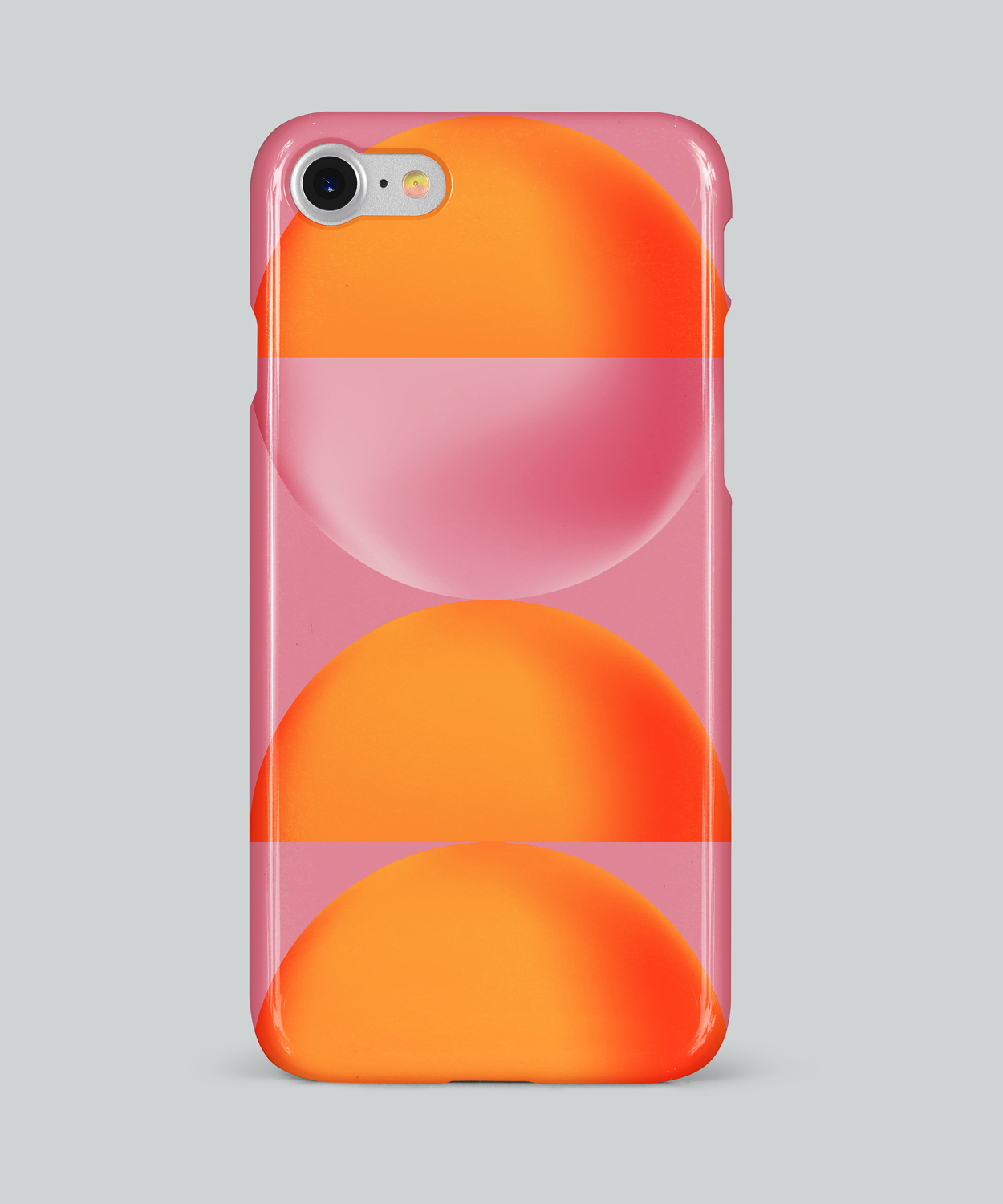
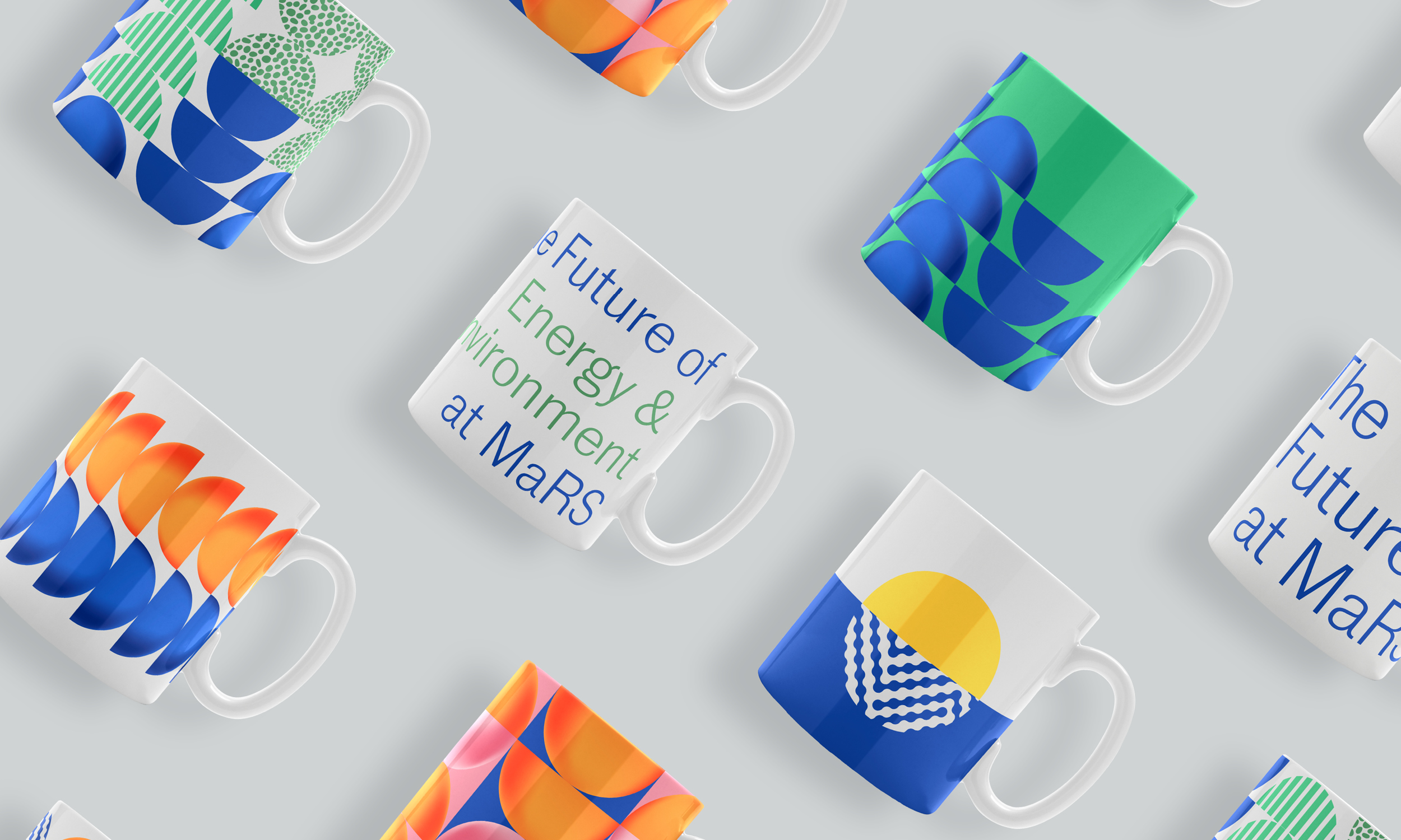
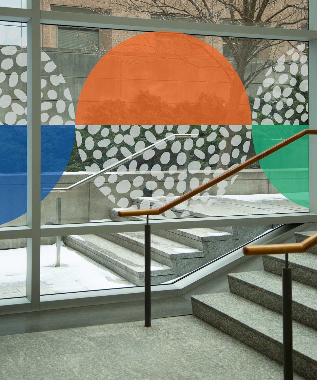
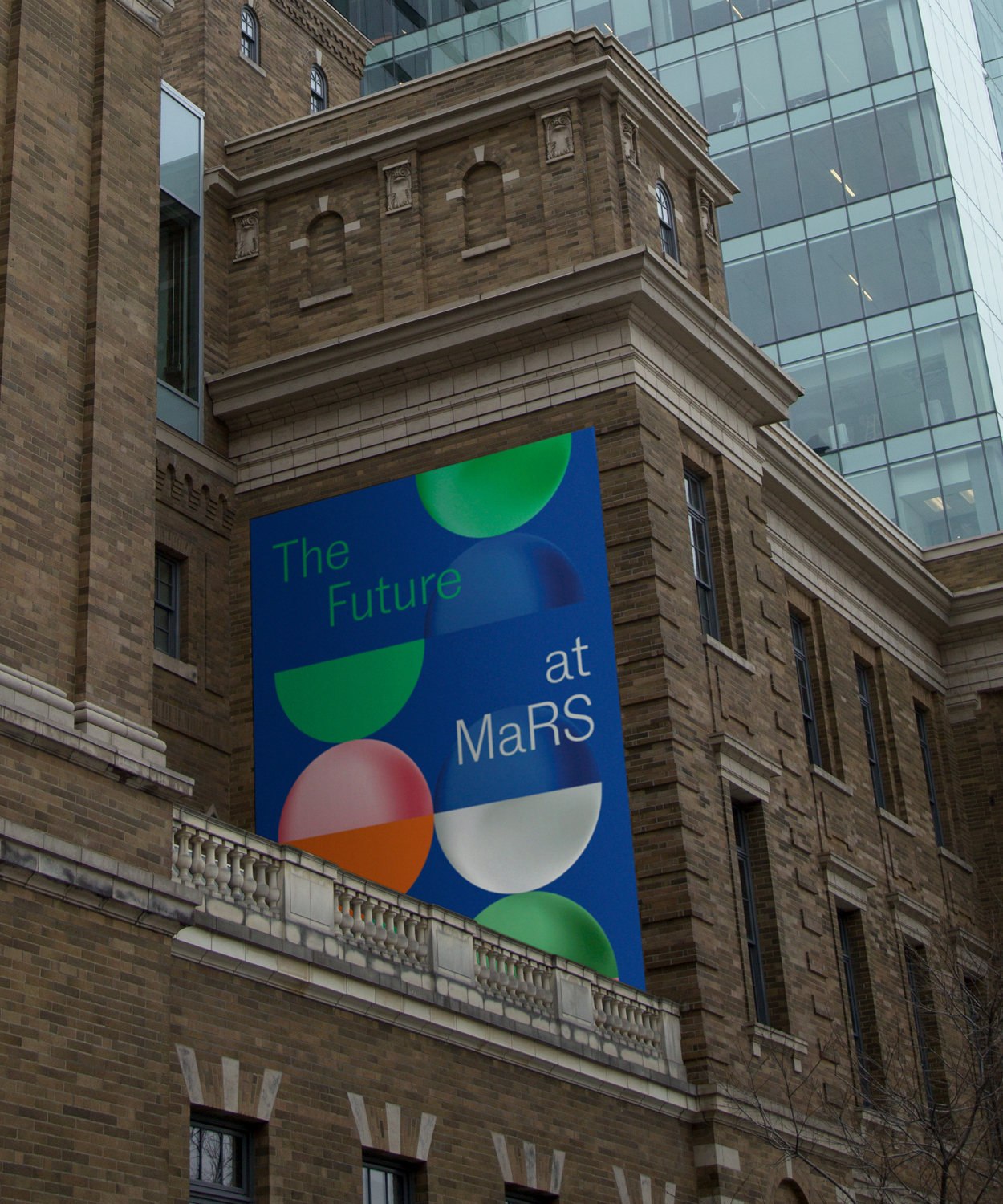
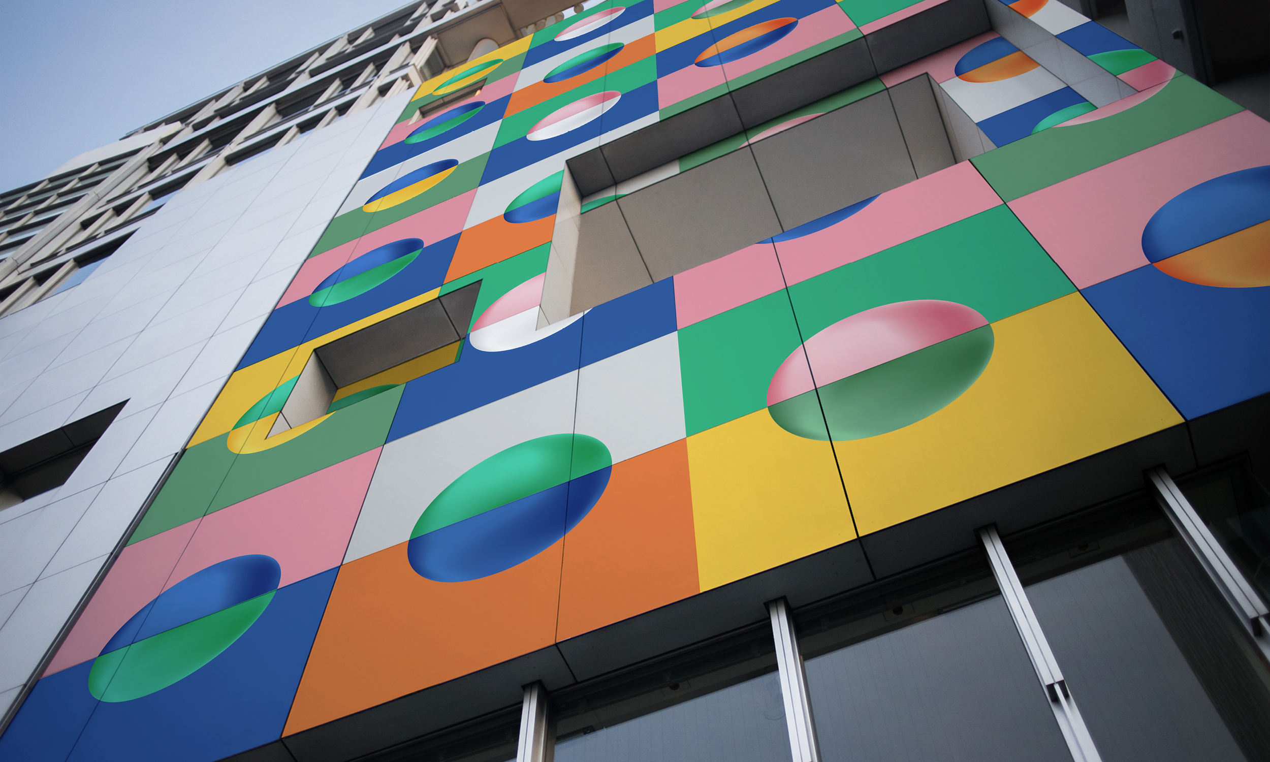
The original MaRS blue 'globe' logo was retained, but deconstructed and given dimensionality to signal the different facets of MaRS — active creation, scientific rigour, inclusivity and collaboration.
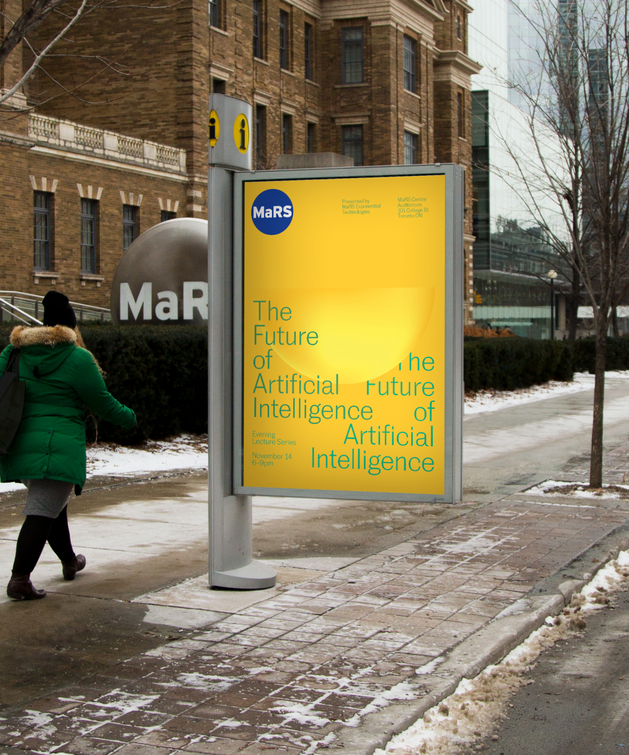
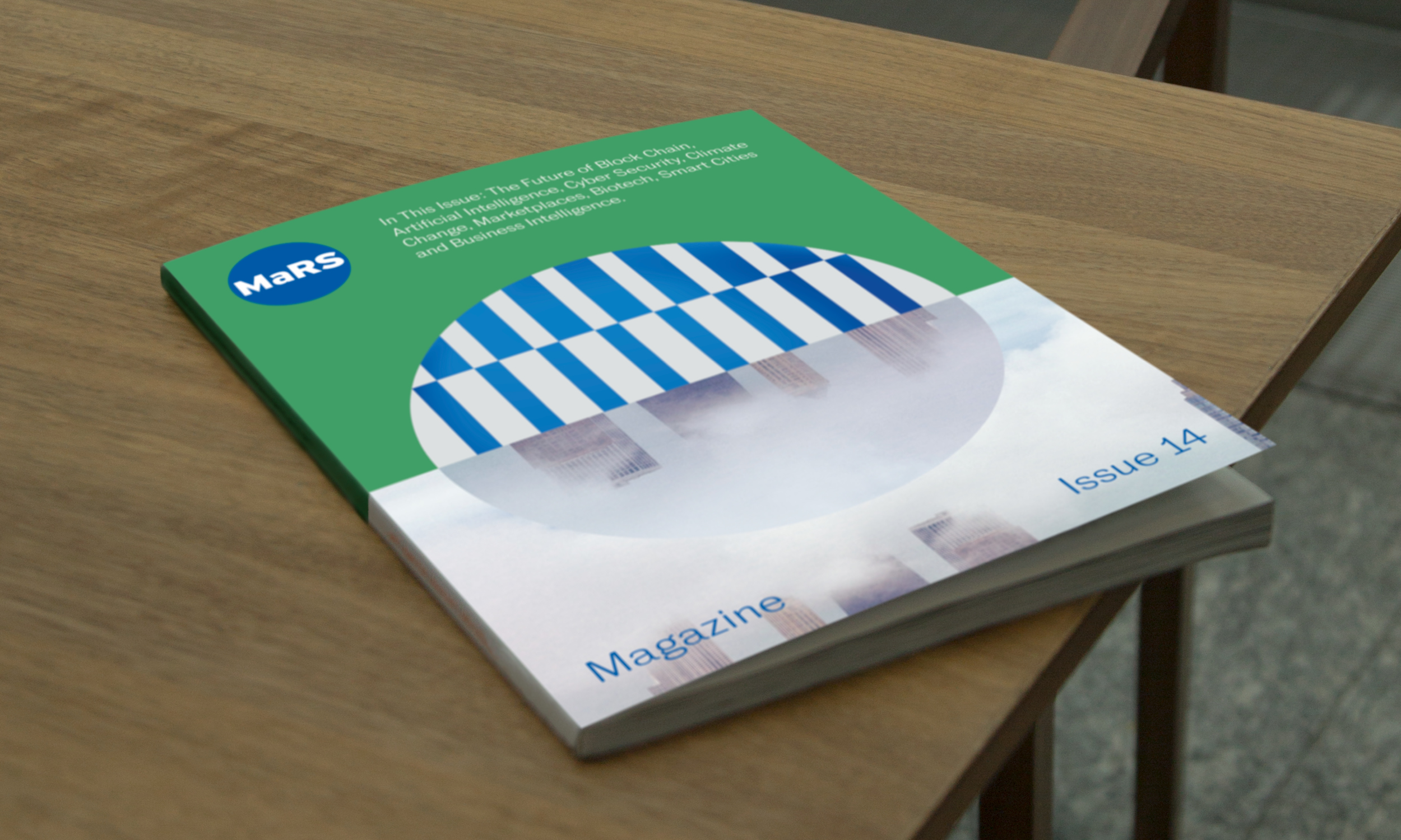
These pieces were used to anchor a new identity system, whose vibrancy and variability matches the true dynamic nature of MaRS.
