McGill University
Identity Refresh and Fundraising Campaign
2019
Identity Refresh and Fundraising Campaign
2019
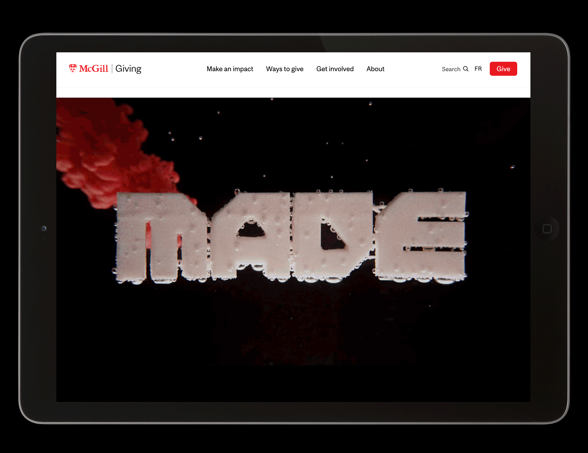
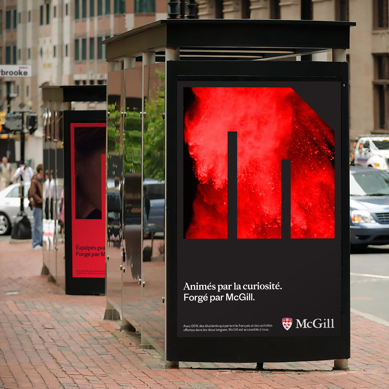
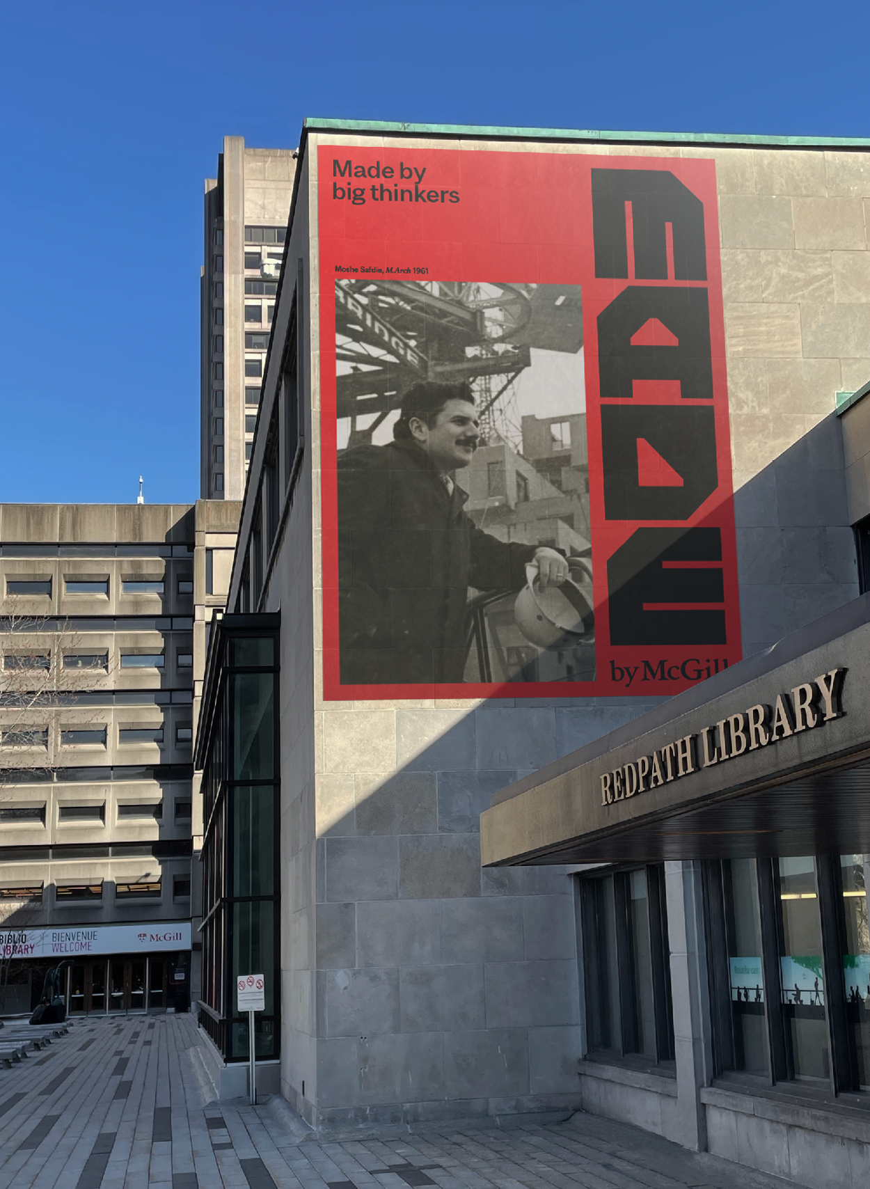
Made by McGill is a campaign brand platform with the ambition of fundraising $2B for McGill University, founded in 1821. The Made by McGill platform celebrates the proud stories of past, present and future McGillians, and invites McGill’s community of trailblazers, dreamers and innovators to come together while looking forward to the next 200 years. Full campaign case study here.
In addition to creating a design system for the campaign platform, the visual identity of one of Canada's oldest universities was refreshed by introducing new tools and visual principles.
In addition to creating a design system for the campaign platform, the visual identity of one of Canada's oldest universities was refreshed by introducing new tools and visual principles.
Completed at Sid Lee.
Executive Creative Director:
Kris Manchester
Creative Director:
Laura Stein
Associate Creative Director:
Dominic Liu
Design:
Dominic Liu, Priya Mistry
Motion:
Olivier Valiquette (CD), David Leclerc, Mathieu McSween, Félix Arsenault, Christopher Hegenberg, Gerardo Manjarrez
Executive Creative Director:
Kris Manchester
Creative Director:
Laura Stein
Associate Creative Director:
Dominic Liu
Design:
Dominic Liu, Priya Mistry
Motion:
Olivier Valiquette (CD), David Leclerc, Mathieu McSween, Félix Arsenault, Christopher Hegenberg, Gerardo Manjarrez
Typeface design:
Coppers and Brasses
Coppers and Brasses

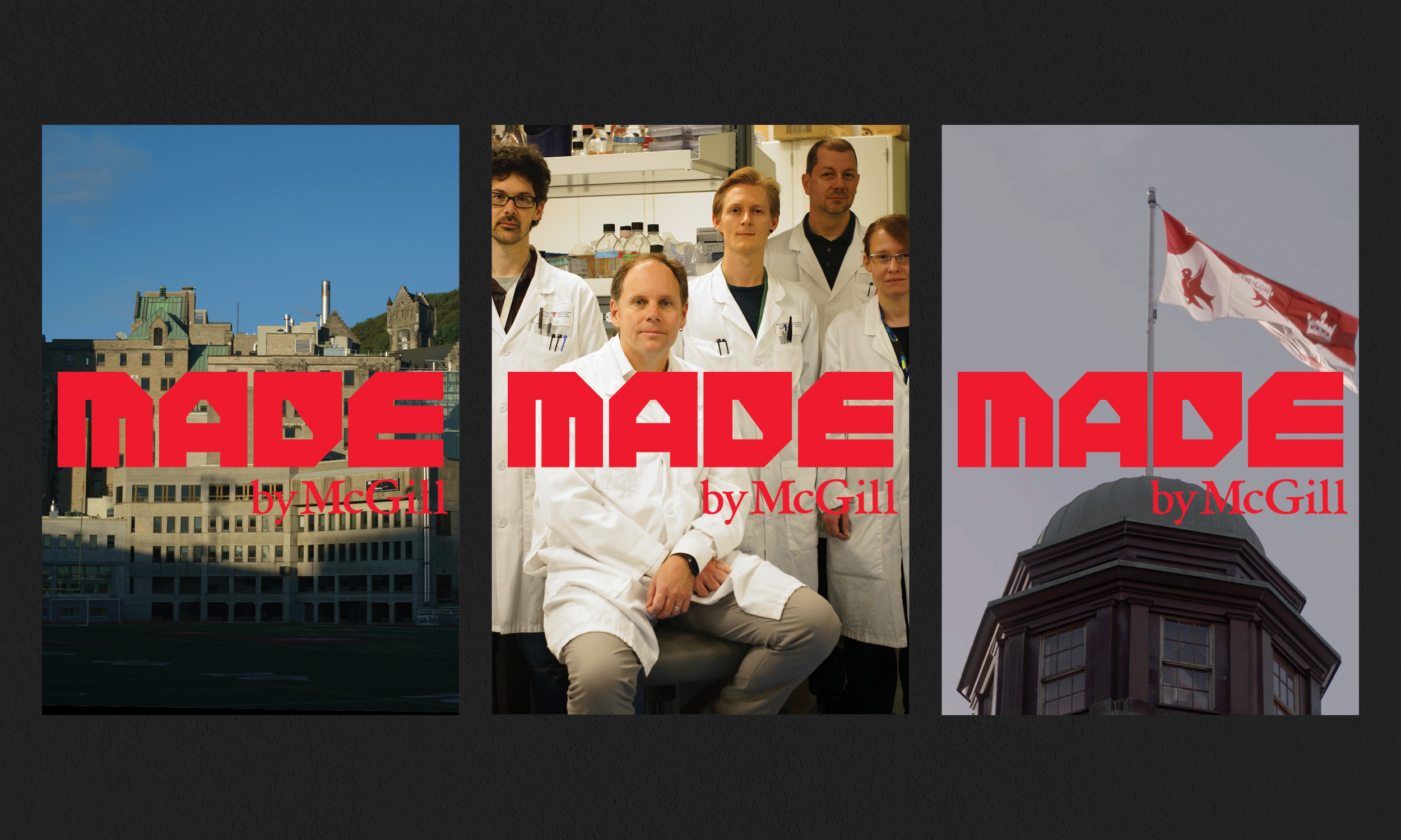
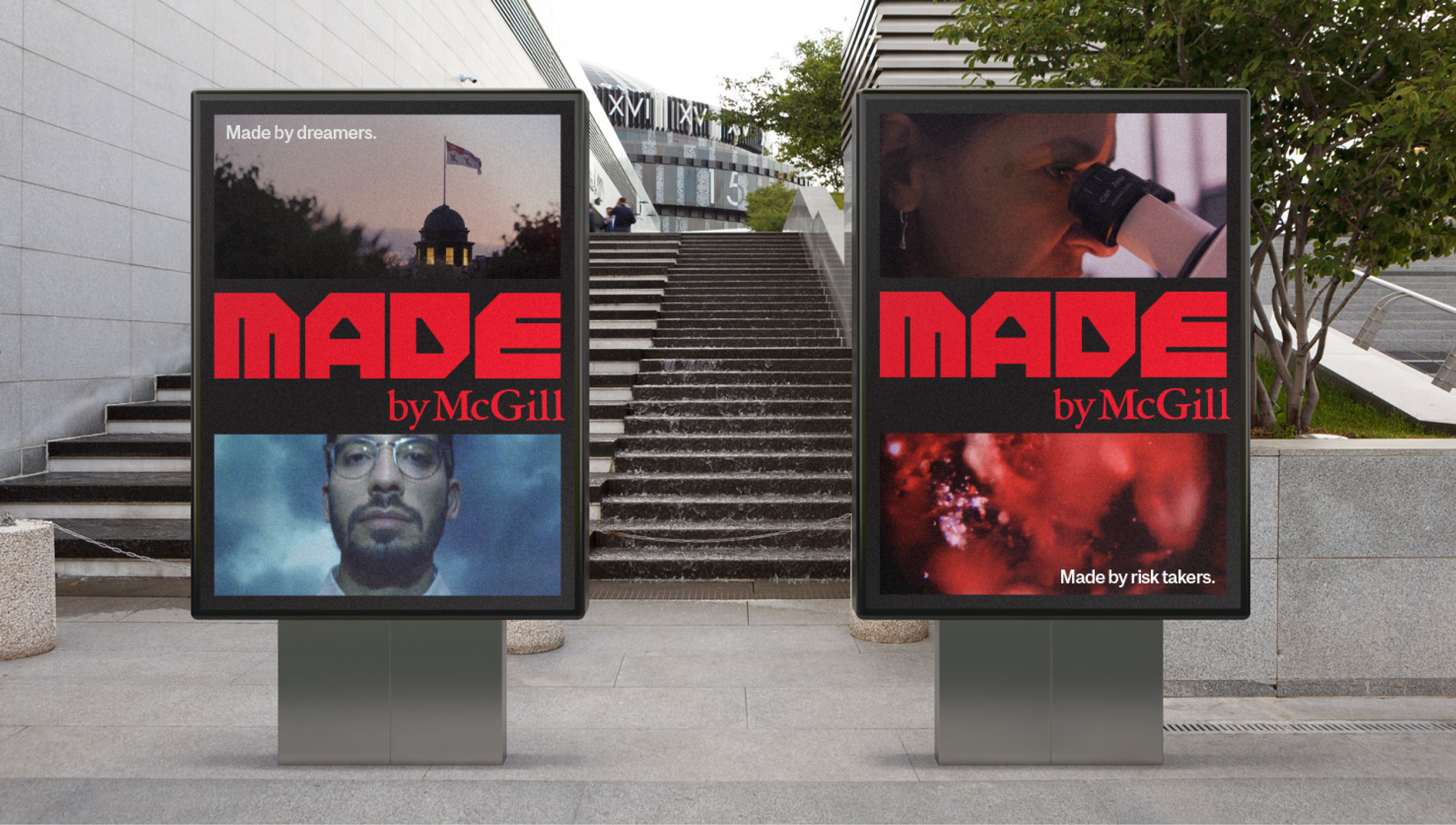
Based on the idea that McGillians are shaped by their experiences at the university, a distinctive mark for the platform was developed that feels chiseled, unapologetically unpolished, and 'made'. The letterforms were inspired by raw modernist architecture of the 60's, a time of great optimism and creativity within the city of Montreal.
The mark was designed to be modular and reconfigurable across many different formats, allowing it to live alongside 200 years worth of stories involving notable alumni, big ideas, and groundbreaking research.


Typography
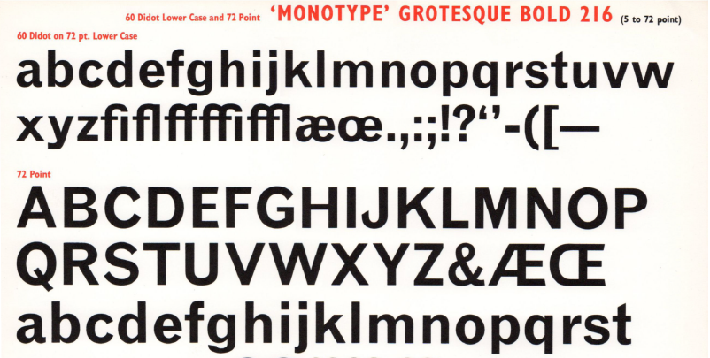
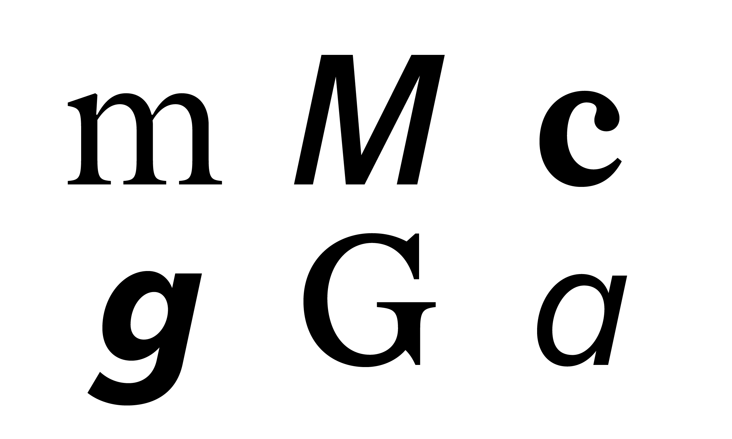
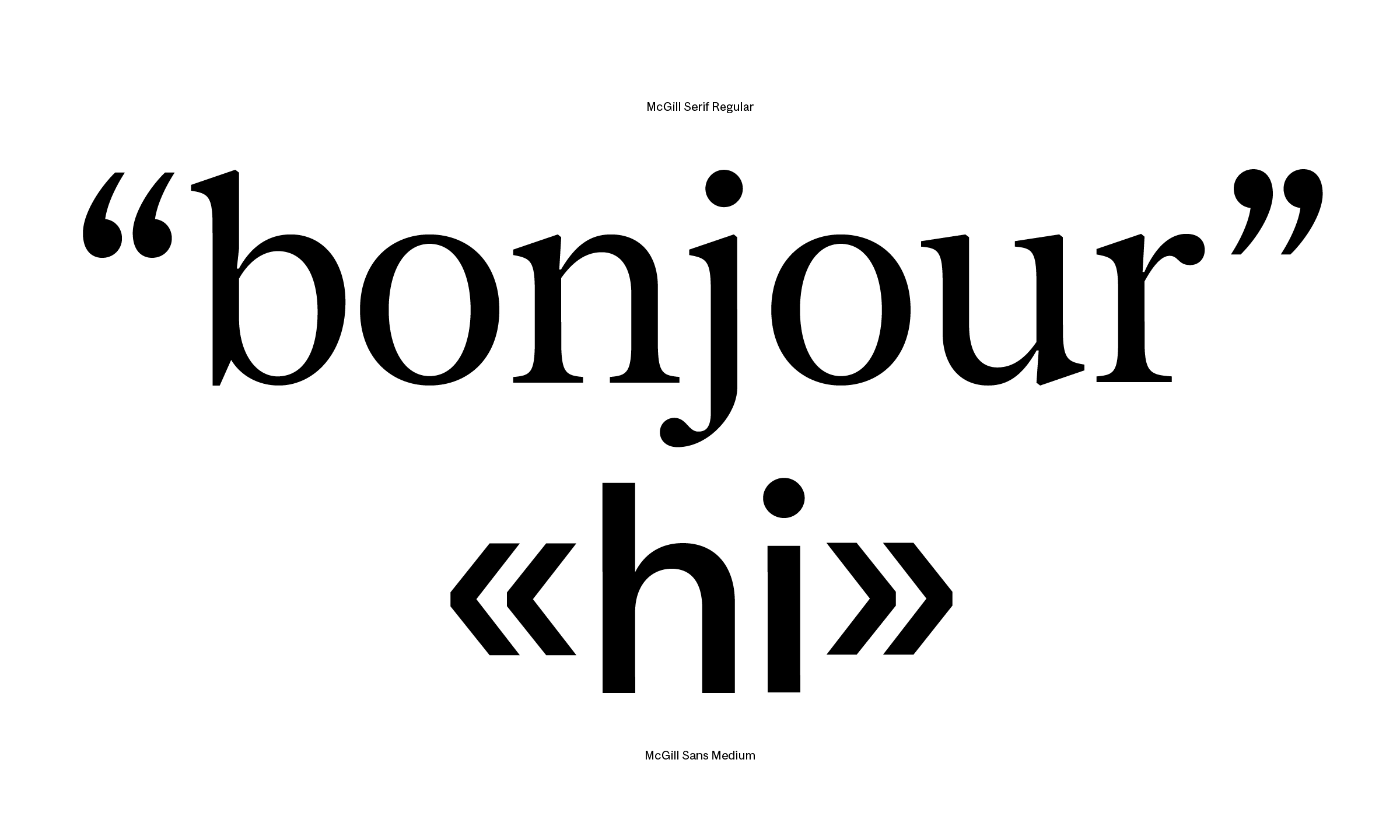
To establish a more distinct typographic voice across communications, Montreal type foundry Coppers and Brasses was commissioned to design a new official typeface for the university. The resulting font families, McGill Sans and McGill Serif, are designed to be easily used together in a single line and therefore share optically adjusted vertical metrics. The serif family’s style is inspired by 19th and early 20th-century British transitional designs, somewhere between a Caslon and a Baskerville. The sans is a grotesk inspired by the many visual quirks found in the vernacular typography used in early advertising in Great Britain.
![]()
![]()
To establish a more distinct typographic voice across communications, Montreal type foundry Coppers and Brasses was commissioned to design a new official typeface for the university. The resulting font families, McGill Sans and McGill Serif, are designed to be easily used together in a single line and therefore share optically adjusted vertical metrics. The serif family’s style is inspired by 19th and early 20th-century British transitional designs, somewhere between a Caslon and a Baskerville. The sans is a grotesk inspired by the many visual quirks found in the vernacular typography used in early advertising in Great Britain.


In recognition of the huge number of groups and diverse voices at McGill, a loose and flexible typographic approach was proposed where any cuts of the typeface family could be mixed freely. The use of consistent typographic tools, combined with the conscientious use of McGill red, provide a framework of structured eclecticism that allows freedom for the many voices on campus to be expressed in different ways.

Bicentennial
Finally in anticipation of McGill's bicentennial year in 2021, the Made by McGill visual toolkit was extended to include tools and materials to mark the year of celebration.
![]()
Finally in anticipation of McGill's bicentennial year in 2021, the Made by McGill visual toolkit was extended to include tools and materials to mark the year of celebration.


